

Nowadays, the dark mode feature has become everyone’s default go-to display setting due to many reasons; like its ability to prolong the battery life of a device, reduce eye strain, and increase visibility for people with low vision who are sensitive to bright light.
Hence, it is essential for applications to give it's users a choice on their display theme. In this article, we are going to learn the easiest way to add the dark mode feature to a flutter app.
Prerequisite
- Basic knowledge of dart
- Basic knowledge of flutter
- We are going to be making use of two useful built-in classes of flutter which are; ValueNotifier and valueListenableBuilder.
valueNotifier:
A valueNotifier is changeNotifier that holds just a single value which notifiers the widget that listens when the initial value has been changed. This value can be of any type and this helps in improving the performance of the app by rebuilding only the widget where the change needs to be applied.
valueListenableBuilder:
A valueListenableBuilder as the name implies is a widget that is always attached to a valueListenable and lt checks to see if the valueNotifier value has changed and then builds the new widget accordingly. Think of a feature that's used throughout your app, and you'd like your app to update whenever or wherever that feature changes.
Implementing a Dark Mode Feature
Let's get started on implementing the dark mode feature, we are going to create a new flutter app, the name of the app can be of your choice but for the purpose of this article, we will be naming our app dark_theme.
Main.dart file
The main.dart file is where our material app is going to be built and in the material app we are going to highlight of some of these properties : ValueNotifier, ValueListenableBuilder, ThemeMode , DarkTheme
This is how the code for the main.dart will look like:
import 'package:flutter/material.dart';
import 'firstscreen.dart';


void main() {
  runApp(const MyApp());
}

class MyApp extends StatelessWidget {
  // Using "static" so that we can easily access it later
  static final ValueNotifier<ThemeMode> themeNotifier = ValueNotifier(ThemeMode.light);

  const MyApp({Key? key}) : super(key: key);

  @override
  Widget build(BuildContext context) {
    return ValueListenableBuilder<ThemeMode>(valueListenable: themeNotifier,
        builder: (_, ThemeMode currentMode, __) {
          return MaterialApp(
            // Remove the debug banner
            debugShowCheckedModeBanner: false,
            title: 'Dark Mode',
            theme: ThemeData(primarySwatch: Colors.purple),
            darkTheme: ThemeData.dark(),
            themeMode: currentMode,
            home:  const FirstScreen(),
          );
        });
  }  //MaterialApp
}  //ValueListenerBuilder
In the above piece of code :
The valueNotifier has the ThemeMode property with the variable name as ThemeNotifier which is set to the default light mode.
The ValueListenerBuilder also has the ThemeMode property with a ValueNotifier that listens specifically to the ThemeNotifier to check if the value of the ThemeNotifier has changed and then notifies the builder if the value has changed, to rebuild the widget
The ThemeMode is going to determine the mode of the application if the Theme(which includes the ThemeMode.system and the ThemeMode.light) and darkTheme are available. I added a little tweak to our ThemeData to change the look from our conventional blue color to purple color. You can also play around with the colors and find the one that suits your mode.
firstscreen.dart file
We are going to create another file called firstscreen to show us how buttons reacts to the change in themes and the colors.
This is what the code for the first screen looks like:
import 'package:dark_theme/secondscreen.dart';
import 'package:flutter/material.dart';
import 'main.dart';
class FirstScreen extends StatelessWidget {
const FirstScreen({Key? key}) : super(key: key);
@override
Widget build(BuildContext context) {
return Scaffold(
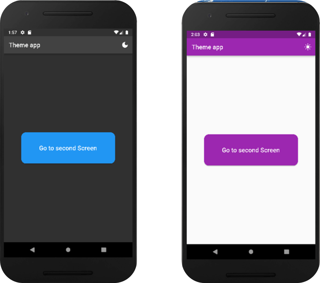
appBar: AppBar(
title: const Text('Theme app'),
actions: [
IconButton(
icon: Icon(MyApp.themeNotifier.value == ThemeMode.light
? Icons.dark_mode
: Icons.light_mode),
onPressed: () {
MyApp.themeNotifier.value =
MyApp.themeNotifier.value == ThemeMode.light
? ThemeMode.dark
: ThemeMode.light;
})
],
),
body: Center(
child: SizedBox(
width: 300,
height: 100,
child: ElevatedButton(
style: ElevatedButton.styleFrom(
shape: RoundedRectangleBorder(borderRadius: BorderRadius.circular(15))
),
child: const Text('Go to second Screen',
style: TextStyle(fontSize: 20),
),
onPressed: () {
Navigator.push(context,
MaterialPageRoute(builder: (context) => const SecondScreen()));
},
),
),
),
);
}
}
In all the chunks of code above, what we are going to look at is the iconButton material widget which houses our icons and our ternary operator. Now in the iconButton widget, we are going to have a ternary operation that includes two icons, one for the darkTheme and one for the lightTheme which are icons.dark_mode and icons.light_mode respectively and in the ternary operation, we are going to say if the themeNotifier value is set to thememode.light then the icons.light_mode icon should be rendered on the UI of the application else render the icons.dark_mode icon.
Now after that has been done we go to the onPressed property where we have another tenary operation which simply says when the iconsButton is pressed if the themeNotifier value is equal to the themeMode.light change to themeMode.dark else change the theme to ThemeMode.light
OUTPUT
secondscreen.dart file
Let's create another file called Secondscreen to show how the text will react to the changes and a better view of the UI layout.
This is the code for the Second screen:
import 'package:flutter/material.dart';
class SecondScreen extends StatelessWidget {
const SecondScreen ({Key? key}) : super(key: key);
@override
Widget build(BuildContext context) {
return Scaffold(
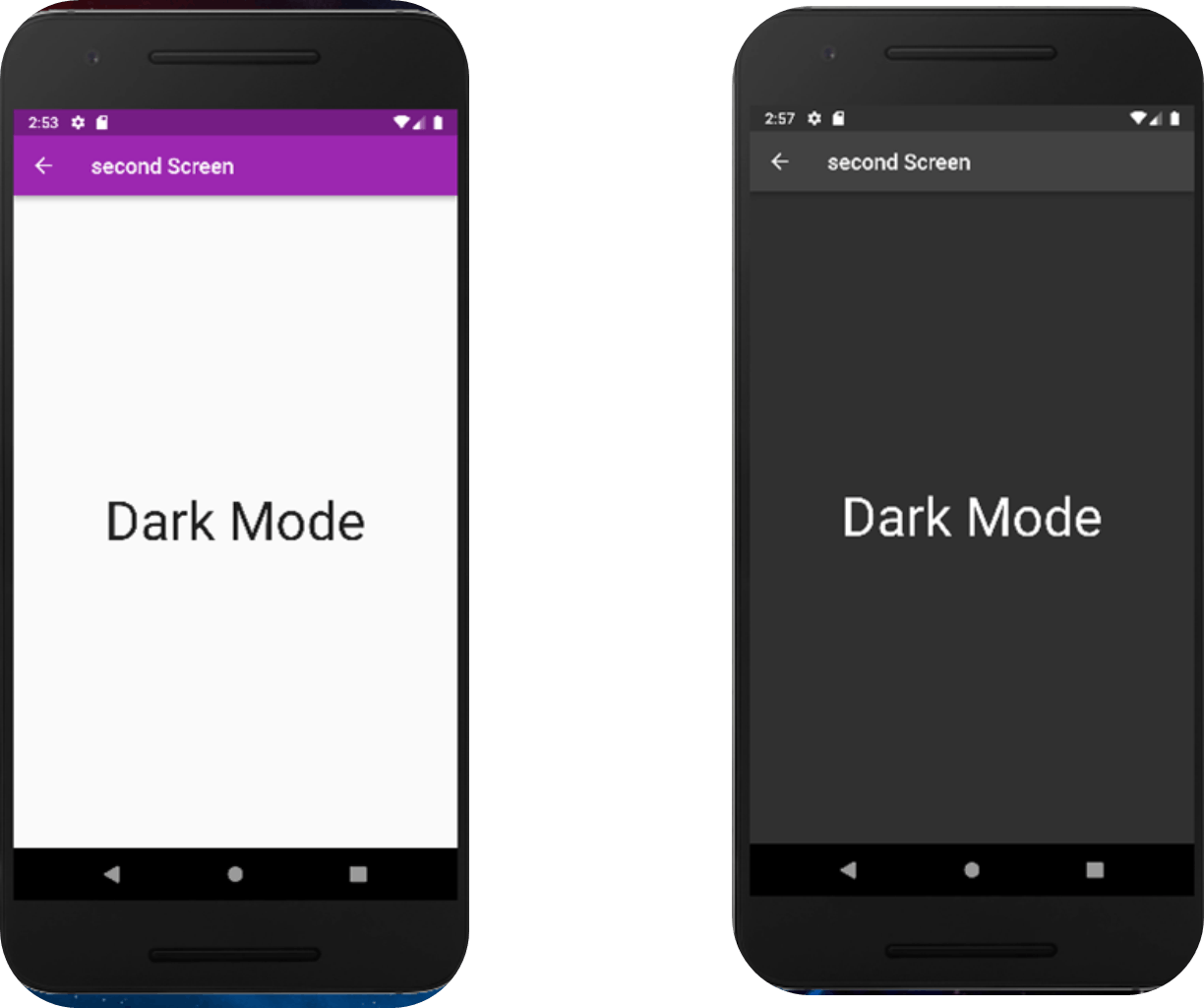
appBar: AppBar(
title: const Text('second Screen'),
),
body: const Center(
child: Text(
'Hello',
style: TextStyle(fontSize: 50),
),
),
);
}
}
OUTPUT
Conclusion
congratulations we have gotten to the end of the article, we are going to do a little rundown on what we've discussed, we learned about value notifier and how it holds a single value, we talked about ValueLIstenableBuilder widget and how it listens to check if the value in the valueNotifier has changed and rebuilds the specific widget attached to it. we also saw how to use the valueNotifier and valueLIstenableBuilder in this application and that we could customize our themeData to fit our various applications if the given ones like the lightTheme does not suit us. Using the iconButton we were able to change the icons accordingly and we set what happens when the iconButton is pressed using a ternary operation.
Please do well to leave a comment and share this article to help others understand how to use the feature in their project, thanks.